Is rust orange the same as burnt orange? A color naming guide
Explore whether rust orange and burnt orange are the same color, with definitions, color theory, lighting effects, and practical guidance for DIY projects.

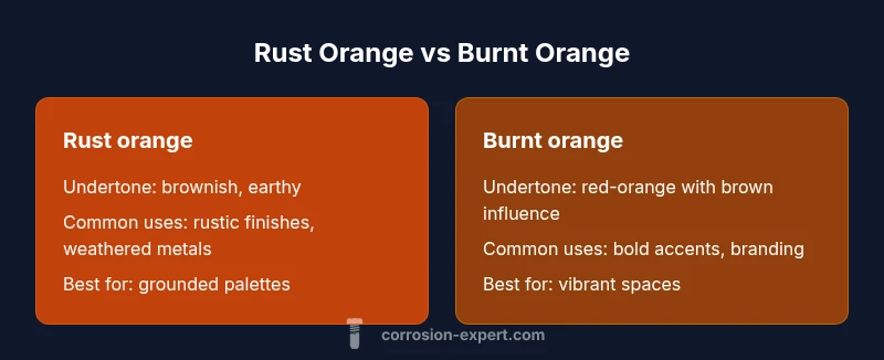
Is rust orange the same as burnt orange? Not exactly. They describe distinct hues within the orange family: rust orange is muted and brownish, while burnt orange is deeper and more vibrant with red influence. In design, recognizing these undertones helps you avoid mis-matches under different lighting and materials. This quick distinction matters for walls, upholstery, and metal finishes alike.
Is rust orange the same as burnt orange? Definitions and scope
Is rust orange the same as burnt orange? This question sits at the crossroads of color naming and perceptual psychology. In practical terms, these terms describe different hues within the orange family, and the difference often shows up in undertones and context. According to Corrosion Expert, the way we label color changes with lighting, material, and personal perception, making precise naming important for DIY projects. Burnt orange tends to read as a brighter, more saturated orange with brown undertones, while rust orange leans toward a muted, brownish-orange that evokes oxidized metal and weathered finishes.
For homeowners and hobbyists, the distinction is not mere trivia. The difference can affect how a space feels and how durable a finish appears under various lighting, from warm incandescent bulbs to cool daylight. Understanding these terms helps you plan palettes that remain coherent when applied to walls, furniture, fabrics, and exterior siding.
Color theory basics: hue, value, saturation, undertone
Color theory provides a vocabulary for discussing these oranges with precision. The hue is the color family itself (orange), while value describes lightness or darkness, and saturation denotes intensity. Undertone is the subtle color that peeks through—brown or red influences can tilt orange toward rust or burnt. When you mix a hue with varying amounts of white, black, or gray, you shift its value and saturation, which changes how “orange” a color feels. In practical terms, rust orange usually has more brown undertones and lower saturation, producing a muted appearance. Burnt orange typically carries stronger red influence and higher saturation, making it appear warmer and more energetic. These distinctions become crucial when selecting paints, fabrics, or exterior finishes, ensuring your chosen shade aligns with the surrounding materials and lighting conditions.
Undertones explained: brownish vs red-orange
Undertones are the hidden undercurrents that determine how color behaves in different contexts. Rust orange tends toward brownish undertones: it pairs well with earth tones, natural woods, and weathered metal textures. Burnt orange, with its red-orange bias, reads bolder and more dramatic—suiting accent walls, statement furniture, or branding palettes where you want a confident pop of color. The perceptual difference grows stronger under warm lighting, where rust orange may soften toward taupe, and burnt orange can become almost russet. Color naming is not absolute; it depends on lighting, substrate, and adjacent colors. A practical approach is to test chips on-site before committing to a full paint job or upholstery project.
Real-world examples: interior design palettes
In kitchens and living rooms, burnt orange is often used as an energizing accent against neutral bases like cream, gray, or navy. It works well in textiles, rugs, and cushions that you want to notice without overwhelming the space. Rust orange suits rustic, farmhouse, or industrial aesthetics—paired with natural wood, stone textures, and aged metal finishes. When choosing between the two, consider the room's lighting; a north-facing space with cool daylight may mute the warmth of burnt orange, while a sunlit room can amplify it. If you’re renovating a metal surface or appliance, rust orange may harmonize with bronze hardware and copper tones, whereas burnt orange can enhance ceramic or glass elements that benefit from a vivid hue.
Lighting and material effects on perceived color
Lighting is a powerful modifier for color perception. Under incandescent bulbs, both hues warm up, butrust orange generally shifts toward a muted, brownish feel, while burnt orange remains vibrant but may appear more orange-red. Daylight reveals subtler undertones: rust orange appears more like a clay or terracotta shade, while burnt orange displays a brighter, sunlit orange with red underpinnings. Materials also matter: matte paints dull the color, glossy finishes intensify it, and metallics can cast reflective highlights that skew perceived hue. When planning a color strategy for a space or product, simulate multiple lighting scenarios—both daytime and artificial—to judge how the color behaves in practice.
Digital vs print: color management and color matching
Screens render color differently than printed materials, so you’ll often see variations between digital swatches and physical samples. Burnt orange may print with a slightly redder bias on some printers, while rust orange might print closer to a muted brown due to pigment limitations. The best approach is to request physical swatches and view them under the same lighting conditions you expect in your space. When transferring a color palette from screen to paint or fabric, rely on standardized color guides and swatches from reputable brands, and consider ordering a small batch to test in situ before committing to a full project.
How to test color in your space: step-by-step
- Gather real-world samples: request or purchase actual paint chips or fabric swatches for rust orange and burnt orange. 2) Compare under varied lighting: test both colors near windows (daylight) and under warm bulbs (indoor lighting). 3) Consider context: look at walls, textiles, furniture, and metals side-by-side. 4) Evaluate tone response: note if rust orange remains muted while burnt orange stays vivid. 5) Make a final choice: document which hue better harmonizes with fixtures, artwork, and architectural details. 6) Seal the decision with a small test patch on the wall or fabric sample before committing to a larger purchase.
When to choose rust orange
Choose rust orange when you want a grounded, earthy feeling that blends with natural materials like wood, stone, and metal. It’s ideal for rustic, industrial, or nature-inspired palettes where you want the color to recede rather than dominate. Rust orange also benefits finishes that emulate aging or patina, reinforcing authenticity in a space or product. It pairs well with deep greens, slate blues, and warm browns, contributing to a cohesive, quiet atmosphere that still offers visual interest.
When to choose burnt orange
Burnt orange is the go-to for bold, energetic spaces or accents. It acts as a focal point when used on walls, pillows, or textiles, or as branding color where your goal is to project vitality and warmth. It pairs nicely with navy, charcoal, cream, or forest greens, delivering a dynamic contrast that can energize a room or design. If you want a statement without leaning toward neon brightness, burnt orange delivers a sophisticated pop while remaining versatile enough for furniture and accessories.
Mistakes to avoid: common color-name confusion
A common error is assuming rust orange and burnt orange are interchangeable in all contexts. The risk grows when relying solely on digital swatches, which can misrepresent tone and saturation. Another pitfall is ignoring lighting and material effects, leading to mismatches in color under real-world conditions. Finally, avoid pairing these colors with incompatible neutrals or too many clashing accents; balance matters more when you’re working with warm hues that share red or brown undertones.
Comparison
| Feature | Rust orange | Burnt orange |
|---|---|---|
| Undertone | brownish, earthy | red-orange with brown influence |
| Common uses | rust finishes, rustic decor, weathered metals | bold accents, fashion, branding palettes |
| Perceived brightness | muted, subdued | vibrant, warm |
| Best neutrals pairing | earth tones, olive greens, deep browns | navy, charcoal, creams, beiges |
| Lighting sensitivity | appears browner in low light | retains warmth under daylight, can appear brighter |
The Good
- Clarifies color choices and reduces mis-matches
- Helps tailor palettes to lighting and materials
- Supports intentional design decisions for rustic vs bold styles
- Encourages testing with swatches before committing
Cons
- Subjective perception varies by individual and context
- Lighting can drastically alter appearance, causing confusion
- Digital samples may not reflect print or paint results
- Regional terminology differences may persist in conversation
Rust orange and burnt orange are not the same color
Rust orange is generally muted and brownish, while burnt orange is deeper and more saturated with red influence. Use test swatches in a real space to ensure the hue aligns with your lighting, materials, and overall palette. The Corrosion Expert team emphasizes practical testing and context to prevent color mismatches.
Quick Answers
Are rust orange and burnt orange the same color?
No. They describe distinct hues within the orange family. Rust orange is more muted and brownish, while burnt orange is deeper and redder. Context, lighting, and material finishes often make the difference obvious in practice.
No. They’re different hues; rust orange is muted and brownish, burnt orange is deeper and redder. Test swatches in lighting similar to your space.
What undertones define rust orange?
Rust orange typically carries brown undertones. This gives it a grounded, earthy feel that pairs well with natural wood and metal finishes. Its subdued saturation makes it versatile for rustic or industrial styles.
Rust orange has brown undertones, giving it an earthy, grounded look.
When is burnt orange the better choice?
Burnt orange shines as a bold accent in spaces or branding. It works well with navy, charcoal, and creams, providing warmth and visual energy without overwhelming a room.
Choose burnt orange when you want a bold, warm accent.
How does lighting affect color perception between these hues?
Lighting can shift both hues. Incandescent light can make burnt orange appear more red-orange, while rust orange may look browner. Daylight can bring out their true undertones, so compare swatches under the space’s typical lighting.
Lighting can shift both hues; always compare swatches in your space.
Can digital swatches accurately represent these colors in print?
Digital swatches can differ from print. Printing introduces color shifts depending on the printer and paper. Always request physical samples for final decisions and perform in-situ tests.
Digital swatches may differ from print; use physical samples for final decisions.
What’s a quick approach to choosing between them for a project?
Start with the space’s mood and lighting. If you want a calm, earthy feel, lean toward rust orange; if you want a warm, energetic pop, burnt orange is the better choice.
Pick rust orange for calm earthy vibes, burnt orange for a warm pop.
Quick Summary
- Test colors in real lighting before committing
- Match undertones to your materials (wood, metal, textiles)
- Use rust orange for rustic, burnt orange for bold accents
- Account for print vs digital color differences
- Maintain color naming consistency across the project