Rust Like Colors: A Practical Comparison
An analytical, side-by-side comparison of rust-like colors in design versus authentic rust patina, covering color theory, practicality, maintenance, and best-use scenarios for indoor and outdoor projects.

Rust-like colors offer a versatile, earthy palette for design and branding without triggering real corrosion. This comparison weighs design palettes against authentic rust patina across appearance stability, maintenance, and suitability for indoor versus outdoor use. According to Corrosion Expert, color perception shifts with lighting and surroundings, so choose hues that stay readable across environments.
Introduction to rust-like colors in design and corrosion
Rust-like colors occupy a curious niche. They are simultaneously an aesthetic category used in branding, interior finishes, and architectural accents, and a real-world phenomenon that signals material change when metal oxidizes. For designers and homeowners, the phrase 'rust-like colors' describes hues that range from pale ochre to deep brick red, mirroring the natural oxidation spectrum without committing you to actual corrosion. In practical terms, you can achieve these tones with paints, powders, and coatings that mimic iron oxide patinas, or you can let weathering do the job on exterior metal surfaces. According to Corrosion Expert, the perception of rust-like colors depends heavily on lighting, adjacent materials, and the finish applied, which means the same hue can read very differently in daylight versus artificial light. The Corrosion Expert team also notes that color stability matters when you want a long-lasting look, especially in warm climates or coastal environments where UV and salt can shift tones over time.
Color Theory Behind rust-like Colors
Color theory provides a framework for how rust-like colors are perceived in spaces. The base hues span warm oranges, ochres, siennas, and umbers, which sit on the earth-toned side of the spectrum. When paired with cool neutrals or contrasting blues, these tones can read vibrant or muted depending on lighting and saturation. In branding work, designers exploit complementary schemes to ensure rust-like elements pop against dark backgrounds or white spaces, while maintaining legibility. For interiors, the psychology of warm tones suggests comfort and rustic charm, but balance is key: excessive saturation can feel overwhelming in small rooms. In exterior contexts, rust-like colors gain character as natural light shifts throughout the day, so test swatches on the actual surface before committing to a finish. This section draws on color science to help you predict how a hue will behave across environments.
Contexts Where rust-like Colors Shine
Rust-like colors are particularly effective in contexts that benefit from earthiness, heritage, or industrial chic. In interior design, they can anchor a palette with a grounded feel, working well in living rooms, kitchens, or bathrooms when paired with stone textures and natural wood. In branding, rust-like hues convey authenticity and durability, often used for outdoor gear, automotive accents, and artisanal products. Exterior applications, such as metal doors, railings, or siding accents, acquire a weathered prestige that can reduce the need for frequent repainting if protected properly. Outdoor furniture and architectural details gain a sense of history without compromising modern aesthetics. The critical takeaway is to align rust-like colors with material choices and lighting so the chosen hue remains legible and intentional under real-world viewing conditions.
Practical Considerations: Lighting, Material, and Finish
Practical implementation starts with three levers: lighting, substrate, and finish. Lighting conditions—natural daylight, LED, or incandescent—drastically influence how warmth and saturation are read. The substrate matters: metal, concrete, brick, and wood each respond differently to oxides and coatings. Finishes range from translucent stains to opaque enamels and powder coatings. For durability, choose finishes with UV resistance and abrasion tolerance, especially in outdoor environments. If you’re aiming for longevity, pair rust-like colors with protective clear coats or weather-resistant primers. Finally, plan for color drift: rust-inspired hues may shift subtly with temperature, humidity, or proximity to salts—anticipate this in your testing and approvals. This block translates theory into actionable guidance for reliable, repeatable results.
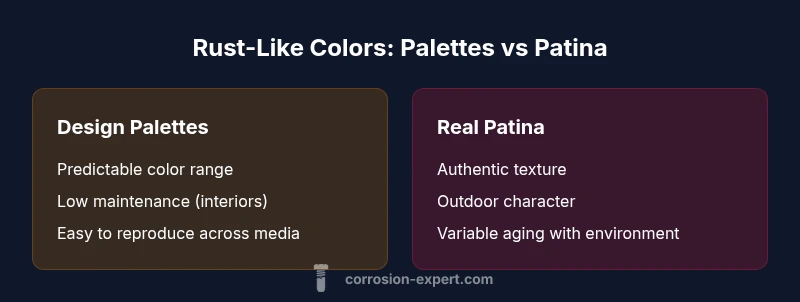
The Design Palettes Path: Pros, Cons, and Best Practices
This path uses color scripts that mimic oxidation without any material change. Pros include predictable color outcomes, broad availability of digital and physical swatches, and minimal long-term maintenance in interior settings. Cons involve potential misinterpretation of rust aesthetics and the risk of a look that feels inauthentic in outdoor contexts. Best practices emphasize calibrating swatches under representative light, testing against actual surfaces, and pairing rust-like hues with materials that soften their intensity, such as whites, grays, and natural textures. In branded projects, consider creating a typography and iconography system that reinforces the rust palette while preserving readability across media. The aim is to deliver a controlled aesthetic that aligns with brand or space goals without introducing real oxidation.
The Real Patina Path: Pros, Cons, and Best Uses
Real patina or authentic rust delivers texture, depth, and tactile realism that can elevate outdoor installations and industrial looks. Pros include authentic warmth, unique aging that develops with time, and strong storytelling through material history. Cons include variability due to climate, maintenance demands, and potential corrosion risk if not protected. Best uses center on outdoor features, sculptures, or architectural accents where weathering is intentional and monitored. When pursuing this path, plan for protective strategies like sealants, corrosion-inhibiting coatings, and regular inspection schedules. The real patina path offers authenticity that design palettes cannot replicate, but it requires discipline and ongoing care to keep the look intentional rather than accidental.
Maintenance, Longevity, and Environmental Effects
Maintenance considerations bridge the two paths. Design palettes demand less upkeep but may require periodic reapplication if color integrity is crucial. Real patina can mature gracefully but needs environmental controls to prevent unwanted degradation. Environmental factors—sun exposure, humidity, salt spray, and pollutants—play a major role in tone drift. In humid or coastal regions, rust-like coatings with UV inhibitors tend to hold their color longer, while genuine patina can darken or alter texture. A practical strategy is to implement a schedule for inspection, cleaning, and re-sealing, especially for exterior installations. Documentation of the surface history helps prevent over-application or premature refurbishment. Throughout, maintain alignment with the project’s longevity expectations and budget.
Color Matching, Calibration, and Testing
Color matching begins in the design studio and moves to the field. Start with calibrated color charts, then test on the actual substrate under multiple lighting scenarios. Use digital renderings to anticipate how the rust-like hues translate in photos and on screens, then validate with physical swatches on-site. Document deviations early, especially if the project spans interior and exterior environments. For real patina, conduct environmental simulations and weathering tests to anticipate long-term changes. The objective is to minimize surprise during installation and ensure that the final result remains faithful to the intended look. Proper testing reduces risk and supports a confident decision, whether you pursue a palette-based strategy or an authentic patina.
Real-World Scenarios: Interior vs Exterior Projects
Interior projects often benefit from rust-like color palettes that are protected by coatings, allowing controlled aesthetics and consistent lighting. Exterior projects, by contrast, may lean toward authentic patina when authenticity and tactile richness are priorities, provided proper protective layers are in place. For mixed-use spaces such as museums, retail, or hospitality venues, a blended approach can work well: use rust-like colors for walls or fixtures while preserving real metal accents in controlled moments where aging contributes to narrative. Always consider maintenance cycles, budget constraints, and the client’s tolerance for visual drift over time. The most successful outcomes arise when decision-makers test early, gather feedback, and adjust the strategy accordingly.
Implementation Checklist: From Concept to Application
- Define project goals: ambiance, branding, or architectural statement.
- Select the path: palette-based or patina-based, or a hybrid approach.
- Test on representative substrates: metal, masonry, wood, and plastics.
- Validate lighting conditions across day and night and adjust as needed.
- Secure a maintenance plan and protective layers for durability.
- Create documentation: color specs, protective coatings, and inspection schedules.
- Prepare for stakeholder review with visual previews and physical samples.
- Roll out in stages to monitor results and refine the color strategy.
Communicating Rust-like Colors to Stakeholders
Clear communication is essential when introducing rust-like colors to teams or clients. Present both aesthetic intent and practical implications, including durability, maintenance requirements, and environmental behavior. Provide visual references, physical swatches, and digital renders that show how the hue shifts under different lighting. Address potential concerns about aging, authenticity, and cost early to avoid misunderstandings. Frame decisions around the project's goals, whether that is a warm, rustic ambiance or a robust, weather-ready exterior, and emphasize how each option aligns with long-term value and brand narrative. By articulating the trade-offs transparently, you empower stakeholders to approve a strategy with confidence.
Actionable Next Steps and Decision Framework
- Review the space, exposure, and audience for the project to establish priorities.
- Compile swatches that cover the full rust-like spectrum and test under real lighting.
- Create a two-path proposal: a palette path and a patina path, with concrete maintenance estimates.
- Schedule on-site verification moments during different times of day and seasons.
- Decide on a primary path, with a contingency plan for adjustments based on feedback and performance.
- Document decisions and prepare a phased rollout plan to manage risk.
- Set up a post-implementation review to assess color stability and stakeholder satisfaction.
Comparison
| Feature | Rust-like Color Palettes (Design) | Actual Rust Patina (Weathered Metals) |
|---|---|---|
| Color Range | Orange-brown to reddish-brown; designed palettes optimized | Varies by metal and environment; authenticity varies |
| Durability/Longevity | Predictable, maintenance-friendly in interior contexts | Real patina evolves with weather; protection may be required |
| Cost/Value | Low-to-moderate upfront; broad accessibility | Costs include protection and potential rework over time |
| Best For | Interior design, branding, art direction | Outdoor features, architectural accents, heritage look |
The Good
- Predictable color outcomes with minimal maintenance
- Wide availability of swatches and finishes
- Low risk of unwanted corrosion on protected surfaces
- Versatile for branding and interior design
Cons
- Does not capture real material aging or texture
- Paints/coatings can chip or degrade if not maintained
- Color drift can occur with environmental exposure in outdoor use
- May require sealing to resist UV or moisture over time
Design palettes excel for control; authentic patina excels for authenticity and outdoor richness
Choose rust-like color palettes when consistency and maintenance predictability matter most. Opt for real patina when the goal is authentic texture and outdoor storytelling, accepting higher variability and upkeep.
Quick Answers
What are rust-like colors in design?
Rust-like colors are warm earth tones that mimic iron oxide hues, ranging from pale ochre to deep brick red. They are used primarily in design palettes to evoke rust without actual oxidation. The look can be achieved with paints, coatings, or patinas that simulate rust.
Rust-like colors mimic iron oxide hues and are common in design palettes to evoke warmth without real rust.
When is it better to use a rust-like color palette instead of real patina?
Use a rust-like color palette when you need predictable color outcomes, lower maintenance, and a controlled aesthetic for interiors or branding. Real patina is better when authentic texture and outdoor presence are essential, and you’re prepared for environmental influences and ongoing protection.
Pick a palette for control; patina for authenticity outdoors.
Can rust-like colors be used in exterior spaces safely?
Yes, but ensure the finish includes UV resistance and moisture protection. Exterior rust-like coatings should be paired with appropriate primers and sealants to minimize fading or chalking, especially in harsh climates.
Exterior use is possible with proper protection and sealing.
Is it possible to combine both approaches in a single project?
Absolutely. Many projects blend a rust-like palette for interiors with authentic patina accents on exterior metal elements, balancing consistency and texture while managing maintenance and costs.
Yes, you can blend both for balance between look and feel.
Do rust colors affect readability in design (text vs background)?
Color contrast and lighting affect readability. When using rust-like colors, ensure sufficient contrast with text and graphics, especially in branding and signage, to preserve legibility.
Watch contrast to keep readability strong.
Quick Summary
- Choose rust-like colors for controlled aesthetics
- Test colors under realistic lighting before committing
- Balance design goals with maintenance needs and environment
- Consider a hybrid approach when both authenticity and control are valuable